Project Overview
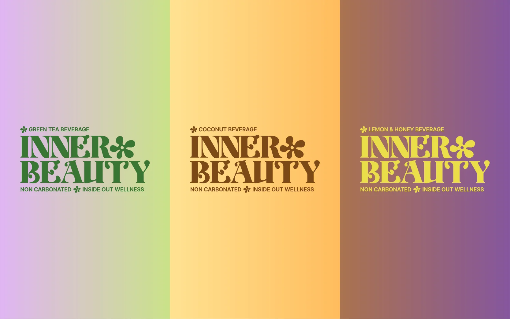
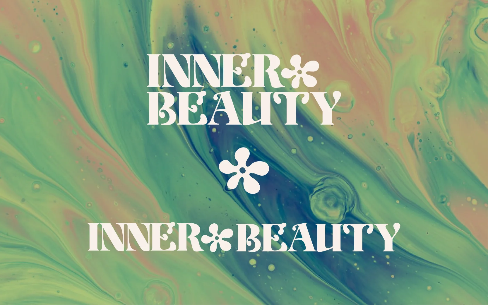
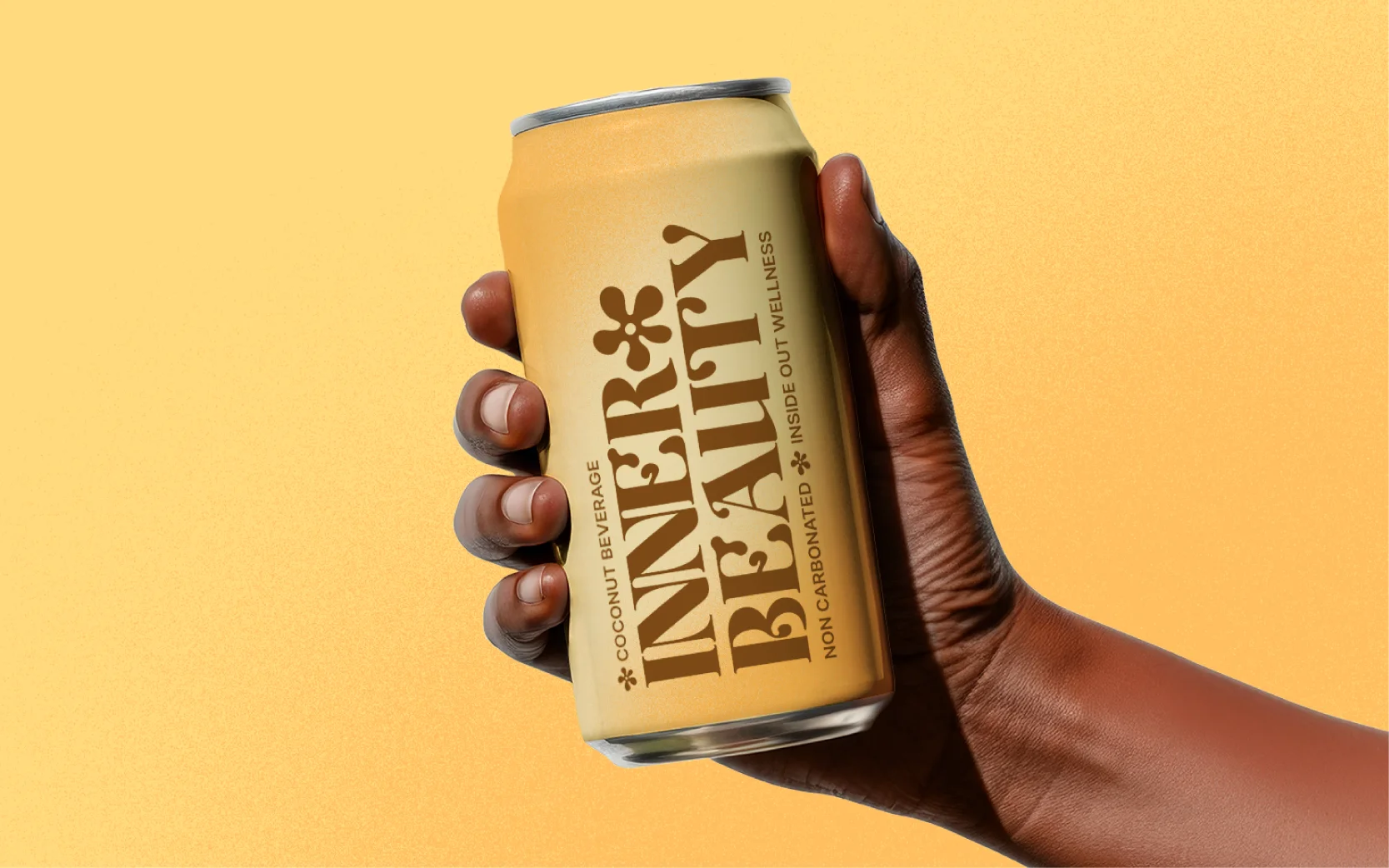
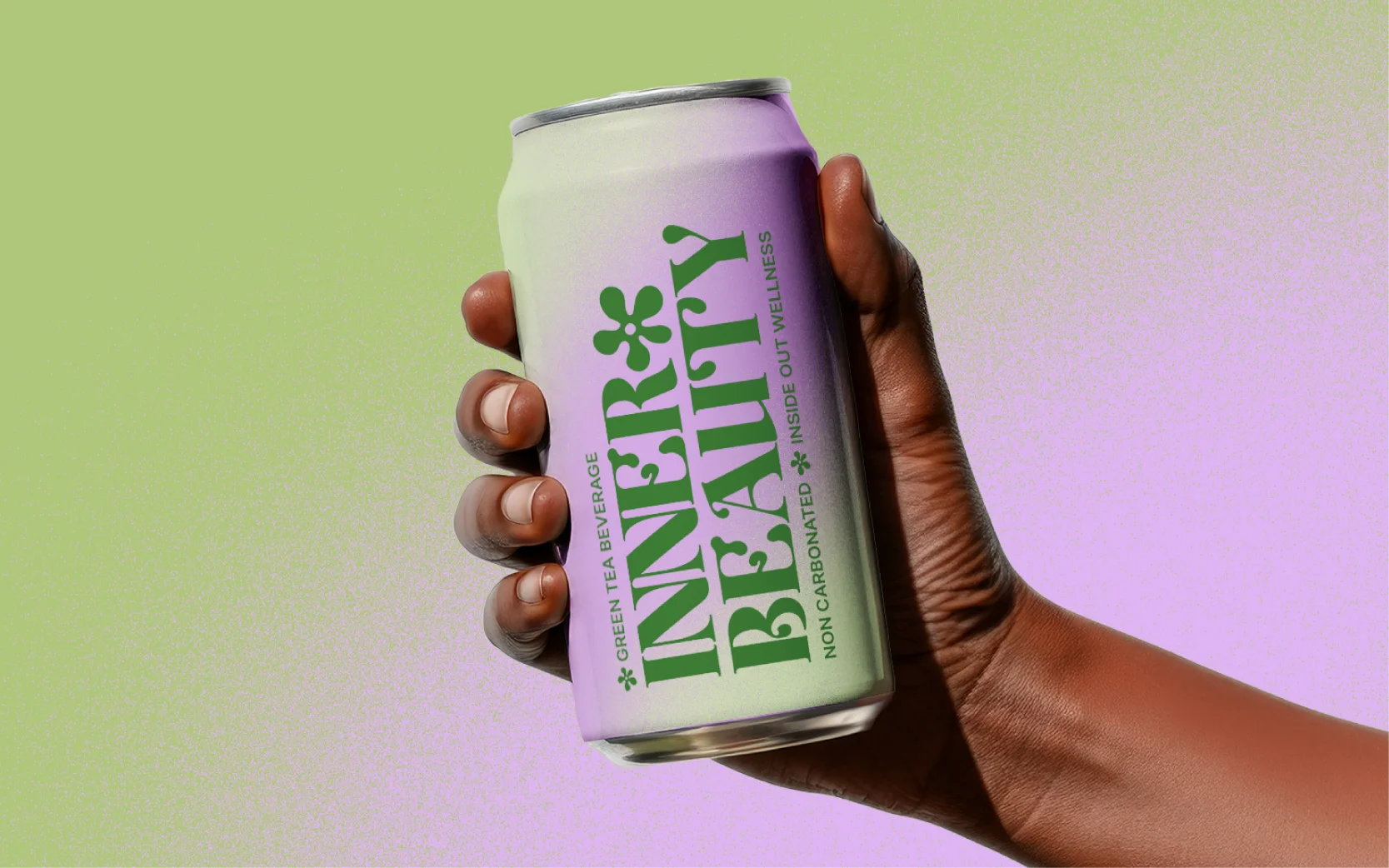
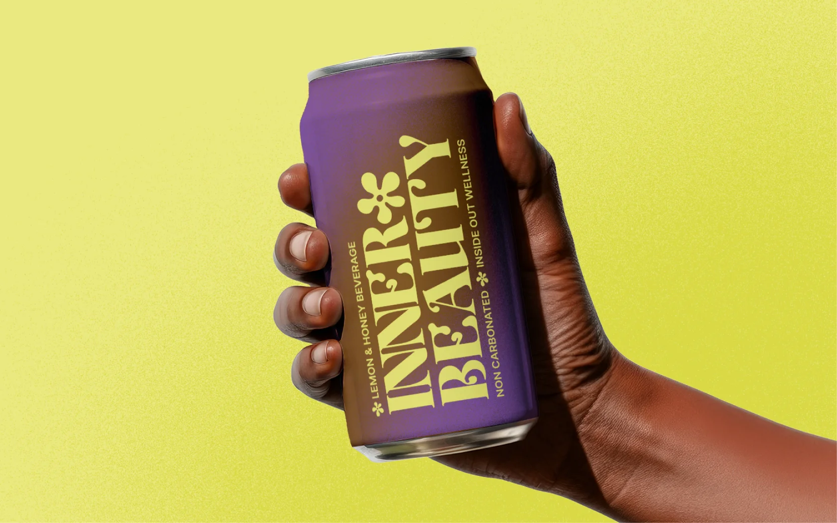
"Inner Beauty" is more than a beverage, it’s a celebration of feeling good from the inside out. I was approached to bring this concept to life through a compelling and modern visual identity that stands out on the shelf & promotes wellness.
Brand Concept
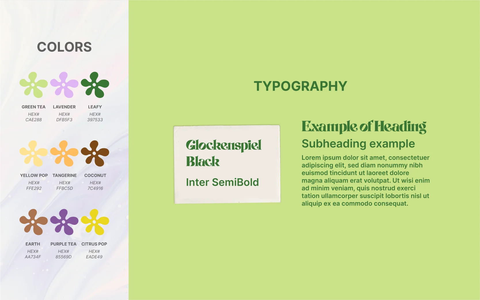
The branding is built around the idea of "inside-out wellness." Each can tells a story—not just of flavor, but of mood and purpose. The name Inner Beauty led the design language, inspiring a playful yet confident visual tone with retro-modern typography and bold, joyful color gradients. Each variant (Coconut, Green Tea, Lemon & Honey) uses a distinct palette that reflects the essence.
Design features
✷ Bold, expressive typography with a vintage charm
✷ Gradient backgrounds for a fresh, feel-good glow
✷ Vibrant colorways to reflect natural ingredients and flavor moods
✷ Clean layout and hierarchy to support product clarity
✷ Emphasis on wellness language (“non-carbonated,” “inside out wellness”)
Why it works
The Inner Beauty branding is designed to attract the health-conscious, design-savvy consumer who values both aesthetics and authenticity. The final result is a cohesive and memorable identity that’s ready to hit boutique wellness shops, lifestyle cafes, and Instagram feeds alike. From concept development to final renders, I led every step of the creative process, ensuring that the visual language aligned with the brand's mission and spoke directly to its target audience.
Happy sippin'!